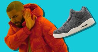
These gotta be beautiful to someone, right?
We’re not breaking Jordan Brand’s balls here. We love you guys (we really do). But as the old saying goes; you can’t please everyone. Sometimes you don’t please anyone at all.
We know it must be hard to continually create and pump out hundreds of colorways each and every year — but with that amount of volume, there’s surely gotta be some bad ones.
And boy, is there.
But before we start, let’s lay down a few ground rules.
1. Only Air Jordans 1-13 (you know, the popular ones)
2. Actually, no Jordan 1s — there’s way too many of them.
3. Men’s colorways only — otherwise the GS colorways would flood the list.
4. Original silhouettes only (no lows, hybrids etc)
5. No Doernbechers. They’re kids, man. Leave ’em alone.
The rest is open for slaughter.
So, without further adieu, let’s get into our 20 Ugliest Air Jordan Retros Ever!
20. Air Jordan 7 “Filbert”
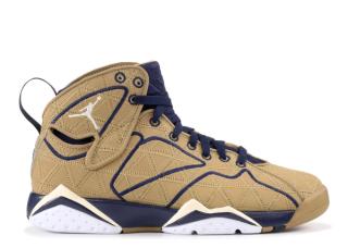
2012’s J2K Pack was kinda of like Jekyll and Hyde. One colorway was decent, the other — well, you can see for yourself. This release, along with Steve Nash’s Nike Zoom BB II Low, had a connection to Nike’s “Trash Talk” program, which focuses on recycling waste materials into wearable sneakers. But all we got was a load of garbage.
19. Air Jordan 8 “Peapod”
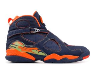
These were released well over a decade ago, but with all due respect to 2007’s trends, these are still ugly. I can’t quite put my finger on this one — maybe it’s the snot green or the dad-jean stitching — but it easily fits the criterion for our list.
18. Air Jordan 6 “Gatorade”
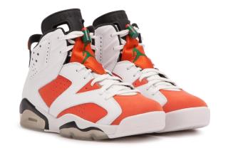
OK, maybe it’s just orange I don’t like. This has way too much of it. And what the hell does Orange go with anyway? Good luck trying to find a fit to go with this that isn’t black.
17. Air Jordan 12 “Cool Grey”
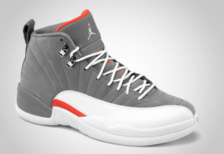
Surprise surprise! Orange again. But that’s not the issue with this pair from 2012. That clunky white mudguard makes these look like an elephants foot from afar. God only knows why these are fetching moderately large after-market amounts.
16. Air Jordan 6 “Beijing”
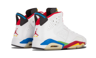
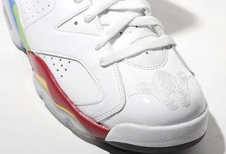
Another Gold Medal for team USA at the Beijing Olympics — that’s no mean feat. But what do we get to celebrate it? A flimsy patent leather trainer that looks like it spilled out of the LEGO factory. The idea was to capture the colorful spirit of the Olympic games, but there’s better ways to do it, which definitely doesn’t include embroidered decal on the toecap — Trans Am style.
15. Air Jordan 8 “White/Anthracite”
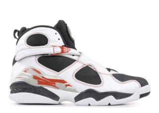
Speaking of Olympic colorways, this Air Jordan 8 clearly drew inspiration from Mike’s Air Jordan 6. With such a wild and busy design, the Air Jordan 8 is at it’s best when it’s simplified — like the Chrome or Aqua 8’s. This is anything but simple.
14. Air Jordan 3Lab5
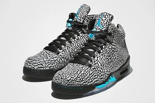
And speaking of busy —WOWEE. the Jordan 3Lab5 is probably one of the wildest sneaker’s in Jordan Brand’s back catalogue. But that doesn’t mean it’s a winner. The iconic elephant print worked so well on the Jordan 3 because it was done in small amounts. This sneaker really does seem to prove that too much of a good thing is bad for you.
13. Air Jordan 5 “Pre-Grape”
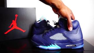
This pair popped up in my Most Regretful Cop list. I blame the “Official Images,” which looked nothing like what I actually got. Instead, I got something with a little too much color, and leather that looks like plastic had sex with PlayDoh. If I didn’t know any better, I would have thought these were fakes.
The leather actually feels nice, TBH — but looks and feels are two completely different things.
12. Air Jordan 10 “Paris”
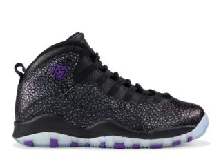
To be real with you, the entire Air Jordan 10 “City Pack” should have made the list. But I didn’t want to bore you with 5 junk colorways of the 10. So I just went with the worst.
11. Air Jordan 11Lab4 // AKA “Gimp Suit” 4’s
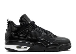
Anyone else think of CJ’s Gimp Suit from GTA San Andreas when they saw these? I sure as hell did. And I still do. I suppose they would come in handy in a sex den, but apart from that, these should never be worn, seen or even talked about.
10. Air Jordan 5 “Laser”
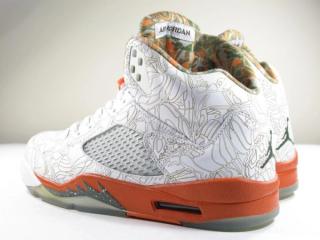
This is the kind of shit Jesse Pinkman would rock to a camper cookout. Nothing works on these. Nothing.
9. Air Jordan 5Lab3
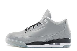
It’s not often Jordan Brand can absolutely destroy a classic like the Air Jordan 3, but when they do, they make a complete and utter butchery of it. Reminiscent of the space-age adidas Kobe 2, these colorless, shapeless, smooth, not to mention fully reflective Jordans are just straight up hideous.
8. Air Jordan 11 Low IE “Volt”
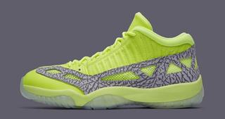
The Low IE originally dropped alongside the OG 11. It never really picked up steam, but that hasn’t stopped Jordan Brand from unloading upwards of 30 or 40 colorways on us over the years. But last weekend’s “Neon Pack” was surely the final straw.
“Lets take an unsuccessful colorway, and put it on one of the most unsuccessful retros — that’ll sell”
Right.
7. Air Jordan 10 “Lady Liberty”
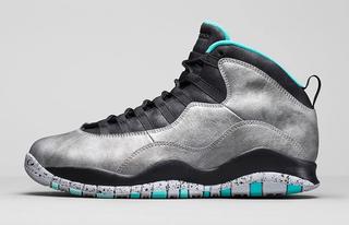
I don’t know any guy who’d knowingly rock metallic silver anything, let alone Air Jordans. And that notion proved to be true, with these Statue of Liberty-inspired 10s ending up at outlets globally for insanely low prices only a short time after release.
6. Air Jordan 2 “Eminem”
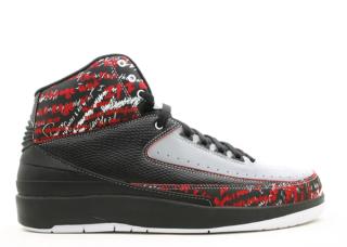
I’ll probably get flamed for this one, but there is nothing good about these. I don’t care who’s name is attached: It’s an Air Jordan 2 — ugly. It’s color blocking is average at best and the written patten is an eyesore.
His effort on the Jordan 4 is by far better.
5. Air Jordan 4 “Ginger”
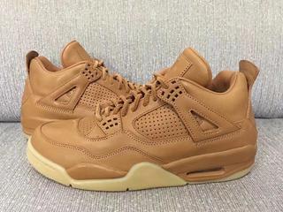
I know what you’re thinking, but no, this image is legit. That stitching, that hideous peanut butter color and that plastic x PlayDoh upper from the PRe-Grape Jordan 5 is the worst combo you could have put together on a PREMIUM Air Jordan.
4. Air Jordan 7 “Ugly Sweater”
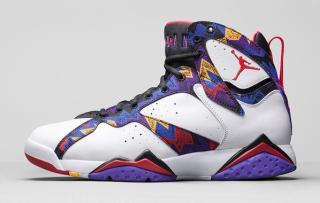
These had to make the list.
Another pair that featured in my list of regretful pickups, the aptly named “Ugly Sweater” Air Jordan 7 is just that. Ugly. In fact, the T-shirt that inspired it is anything but. So how could something so lit, be recreated into something so dull? I don’t know, but they managed to do it.
3. Air Jordan 3 “Wool”
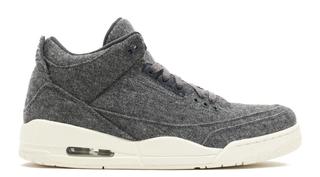
These are so ugly I don’t even know where to start. So I won’t.
2. Air Jordan 12 “Wool”
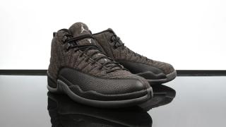
What’s worse than the woollen Air Jordan 3? The 12. From an ugly stale-brown, grainy wool (that doesn’t even match the mudguard and sole unit) to well, that’s really the only problem. I’m sure there’s still pairs just sitting at my local Footlocker from 2016.
1. Air Jordan 1 “Leroy Smith”
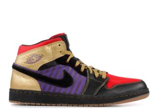
OK — look, I know I said no Air Jordan 1s, but these are ridiculous.
If you don’t know Leroy Smith was a fictional character played by Charlie Murphy. The campaign was set around Leroy’s claims to be the person that beat out Michael Jordan for the last spot on the Laney High School Varsity Basketball team; and Smith says that motivated Mike to be the best basketball player of all time.
The sneaker is based off Leroys outfit from the mock-infomercial below.
The campaign was hillarious, the concept was cool, the execution is wack.
These could have been so much better. Goddamn it, Leroy.
